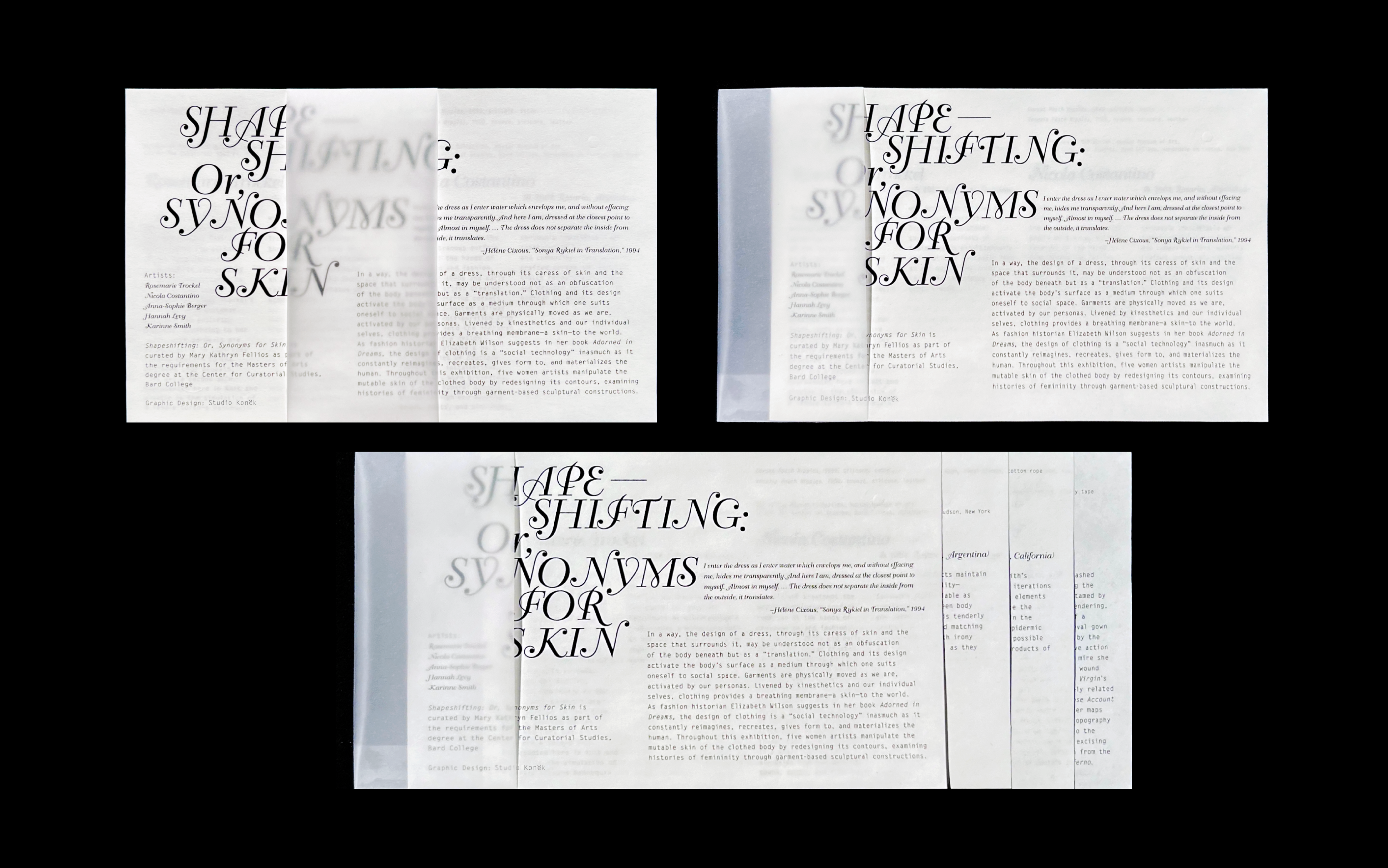
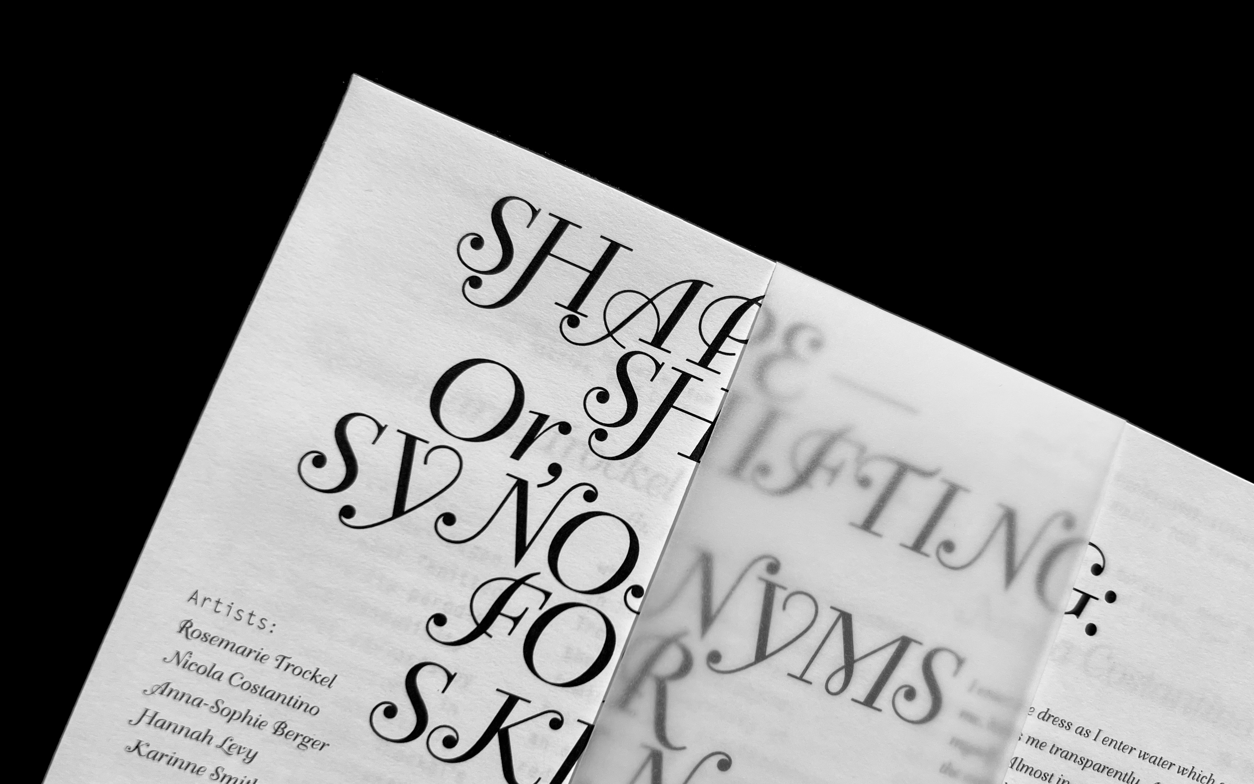
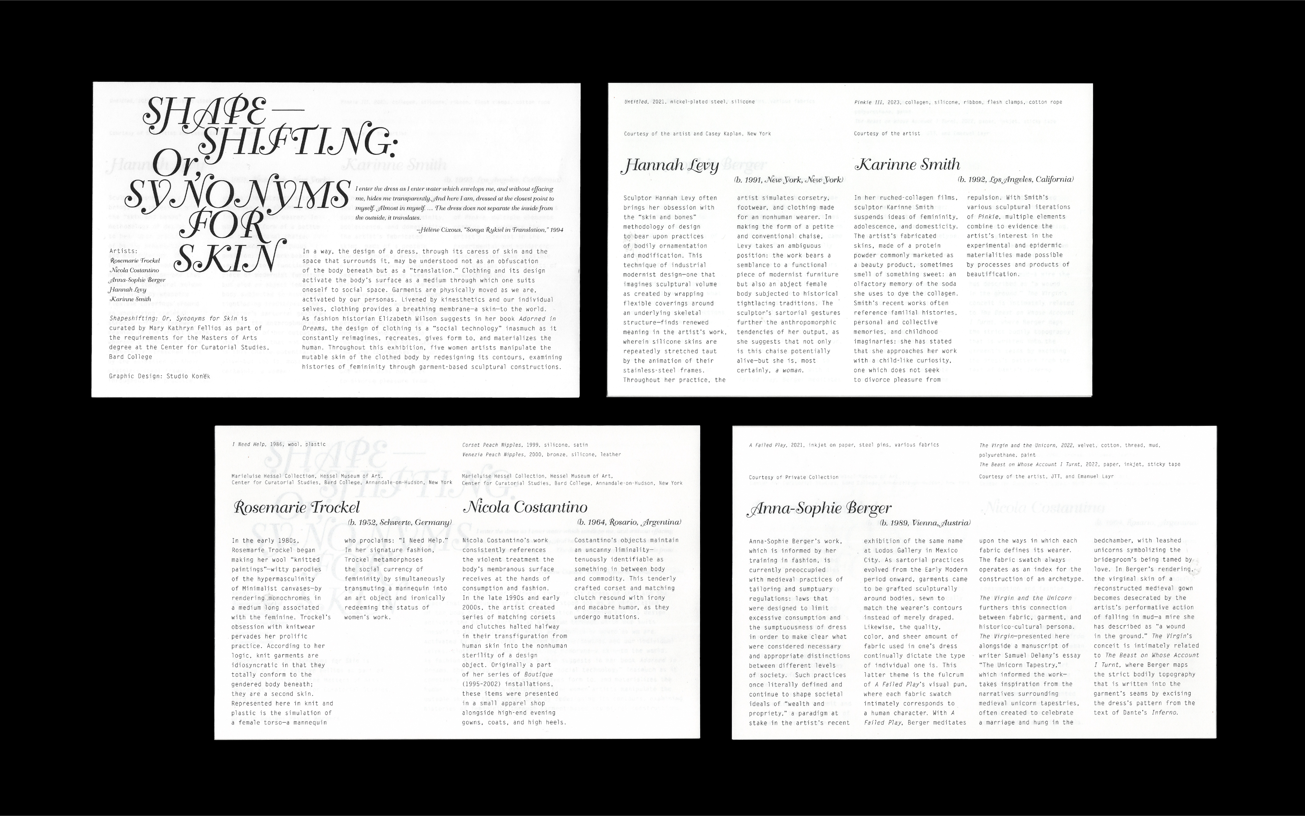
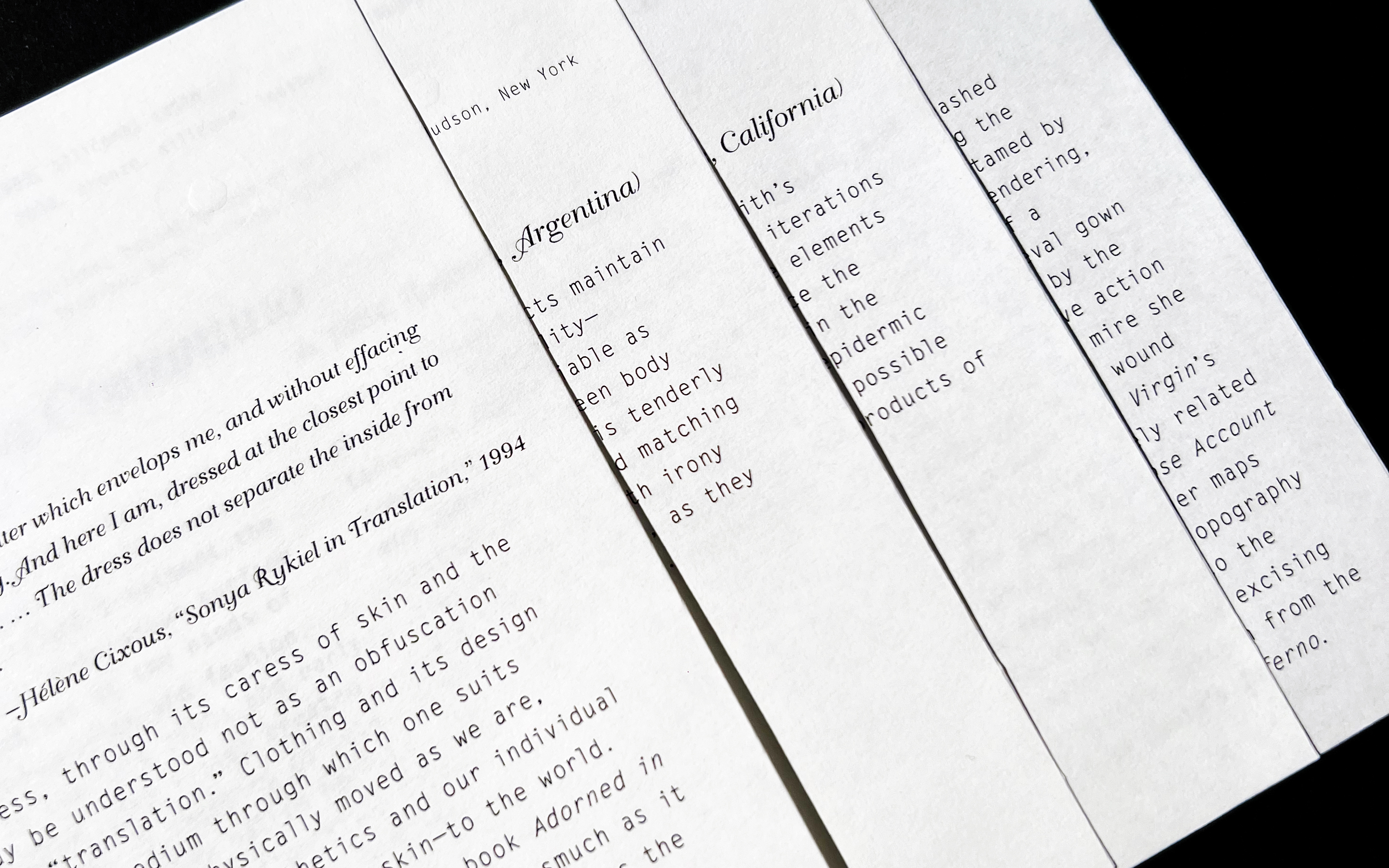
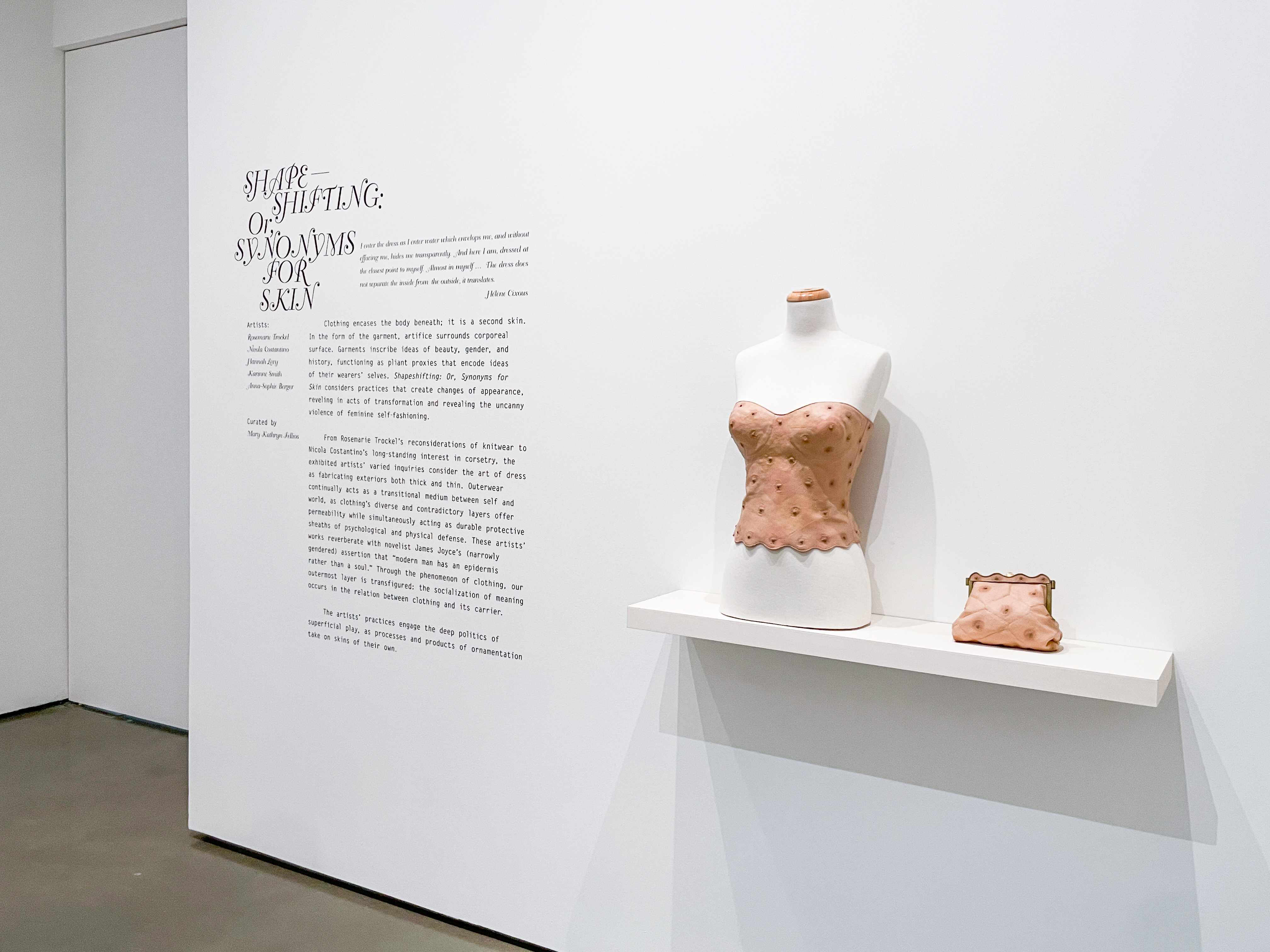
Shapeshifting: Or, Synonyms For Skin
Exhibition Design
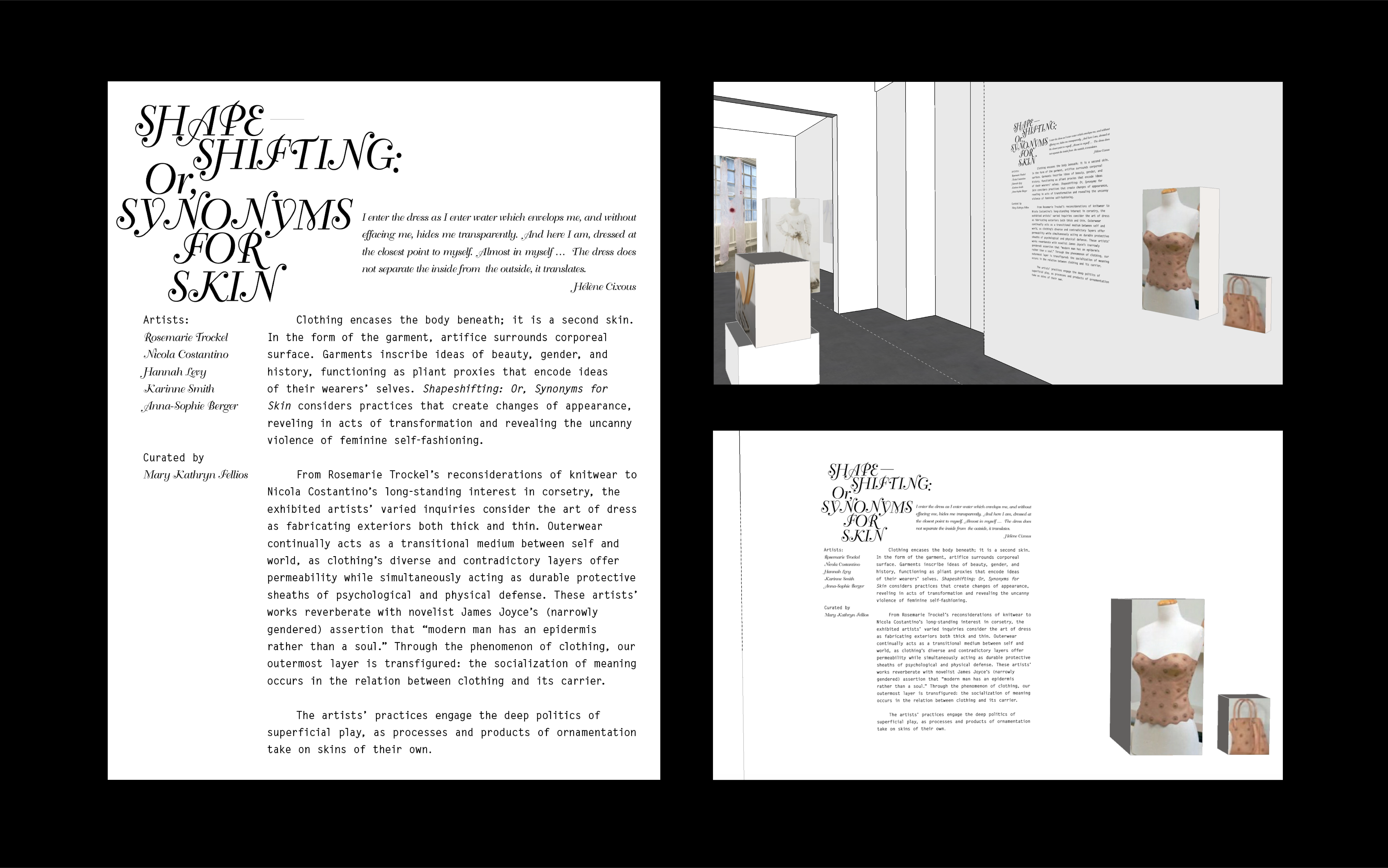
Delivarables:
︎ Logo-design;
︎ Wall Text;
︎ Handouts;
Aim:
Our goal was to design a typographical visual identity for Mary Kathryn Fellios' exhibition that subtly intertwined the theme of clothing and design in persona shaping, without taking away from the art.
Challenge:
The key challenge lay in creating a visually clean design that incorporated the exhibition's theme, while also encouraging visitor engagement without drawing focus away from the displayed artwork.
Solution:
We centered our solution on typography to ensure clarity and engagement. The visual identity, infused in wall text and handouts, subtly echoed the exhibition's theme. The project's title was given decorative flourishes, symbolizing the female perspective in design. The handouts were uniquely designed as a set of cards, delivering a "shapeshifting" tactile experience when pulled apart, bound together with a semi-transparent ribbon. We used a coarser paper to heighten the tactile interaction and prevent the cards from sliding apart, thus adding an extra layer of physical engagement with the design.